
Omela
Branding · Packaging · Art direction
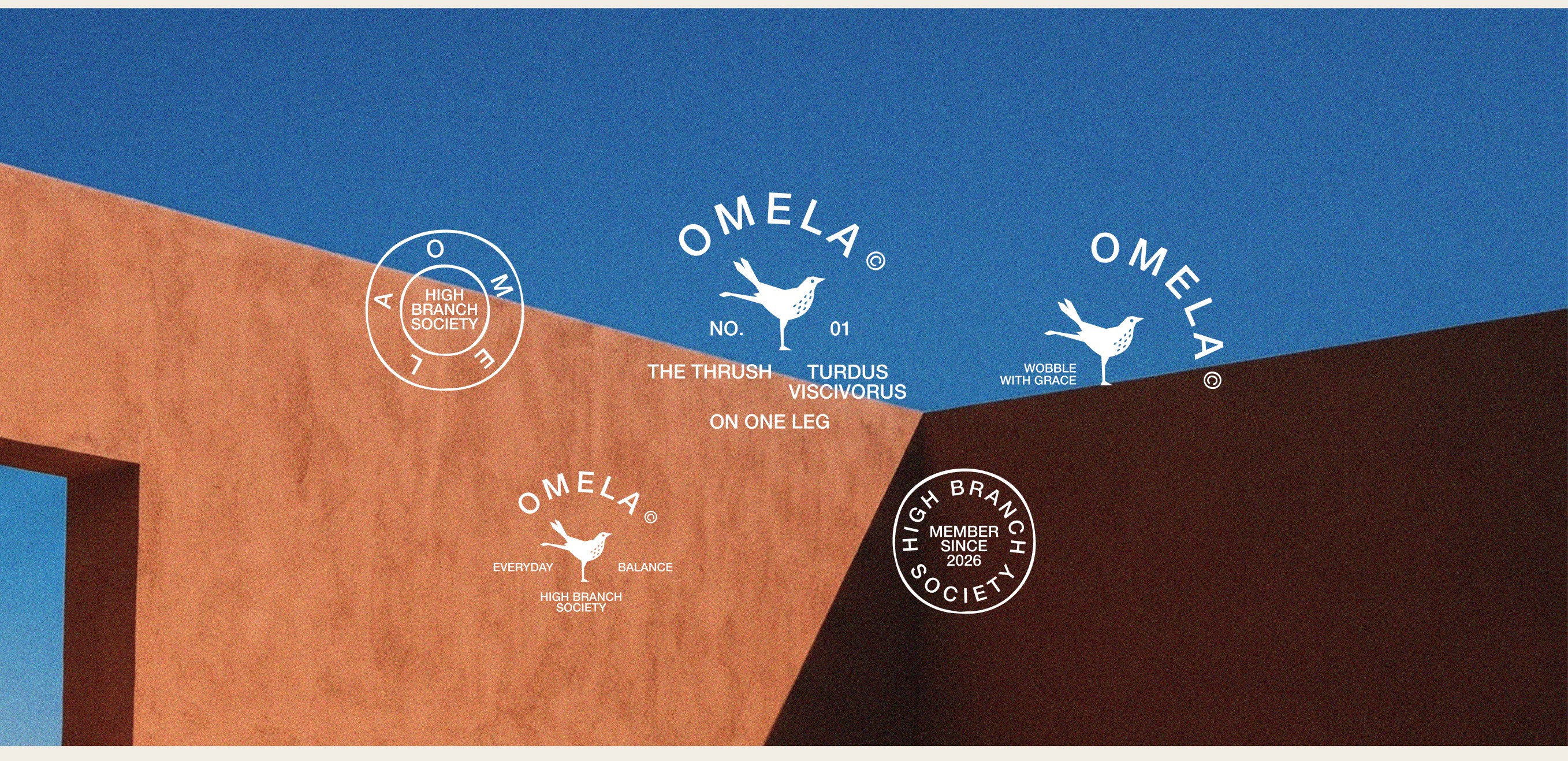
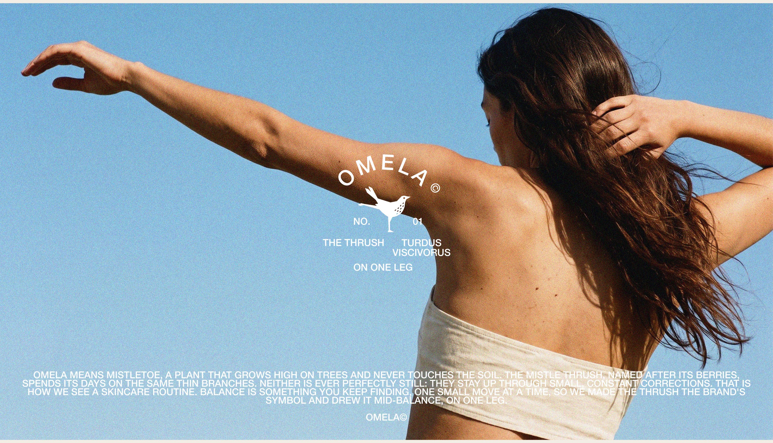
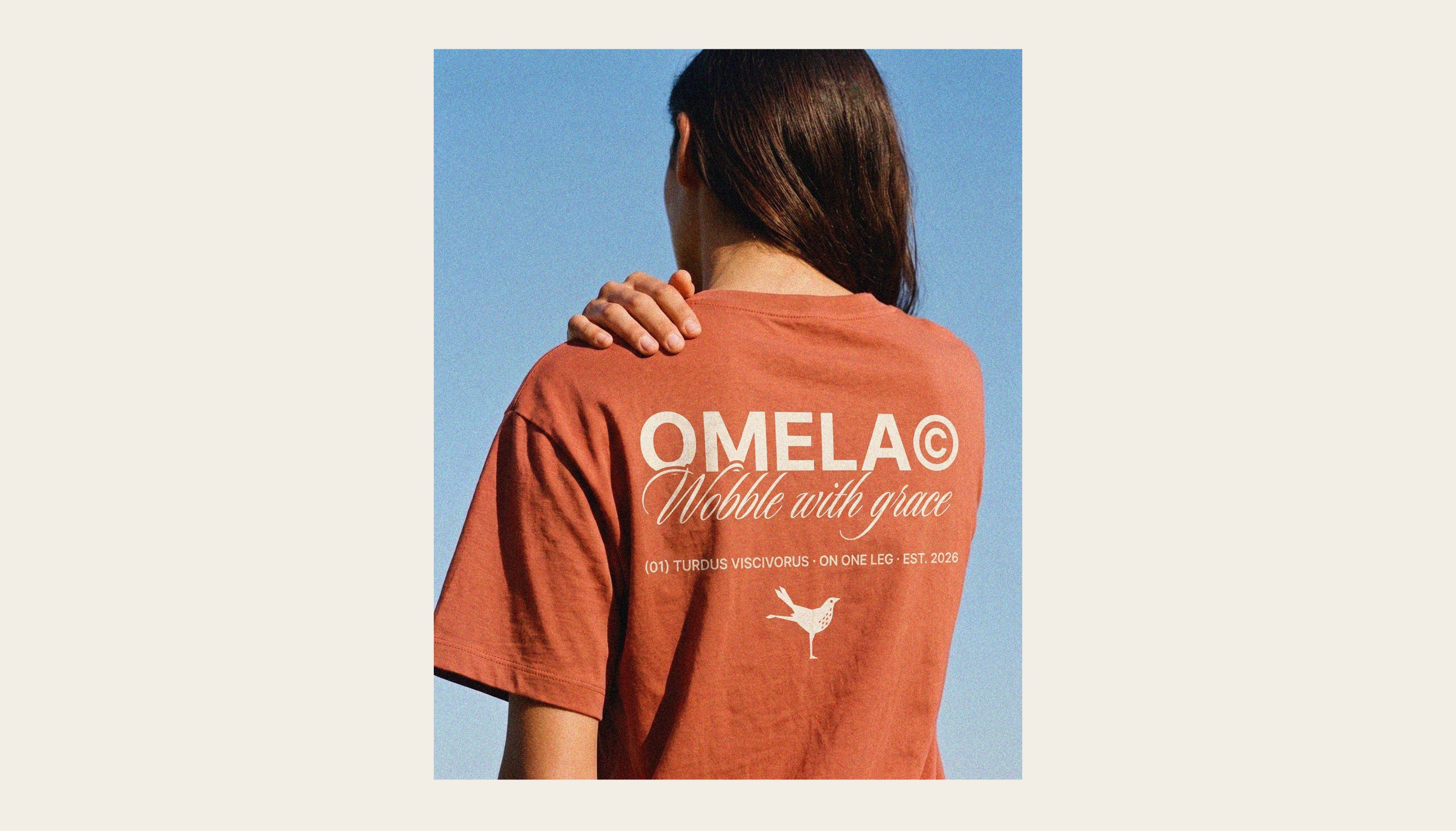
OMELA is everyday skincare for people who want their routine to feel lighter. Good skin, in OMELA's view, is built from small habits kept day after day. The name means mistletoe, a plant that grows high on trees and never touches the soil. The mistle thrush, named after its berries, spends its days on the same thin branches and stays up through small, constant corrections. We made the thrush the brand's symbol and drew it mid-balance, on one leg.
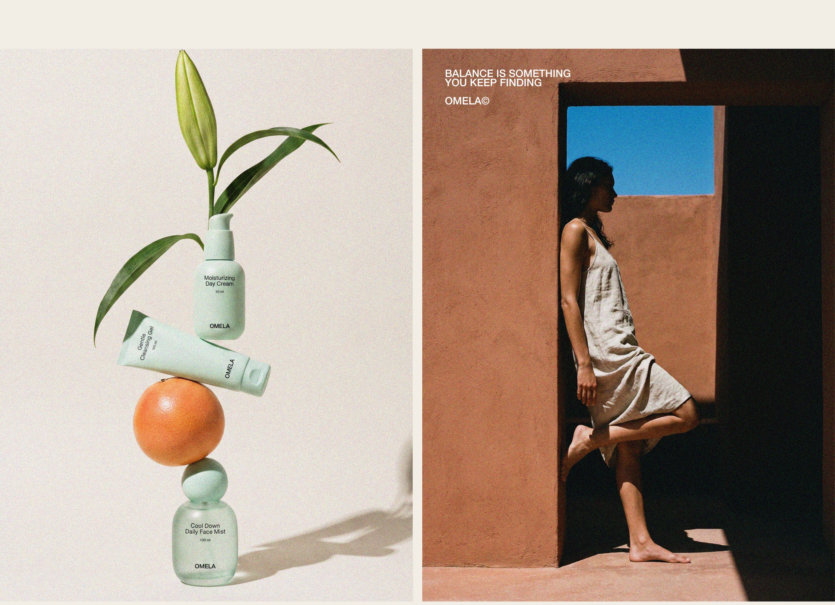
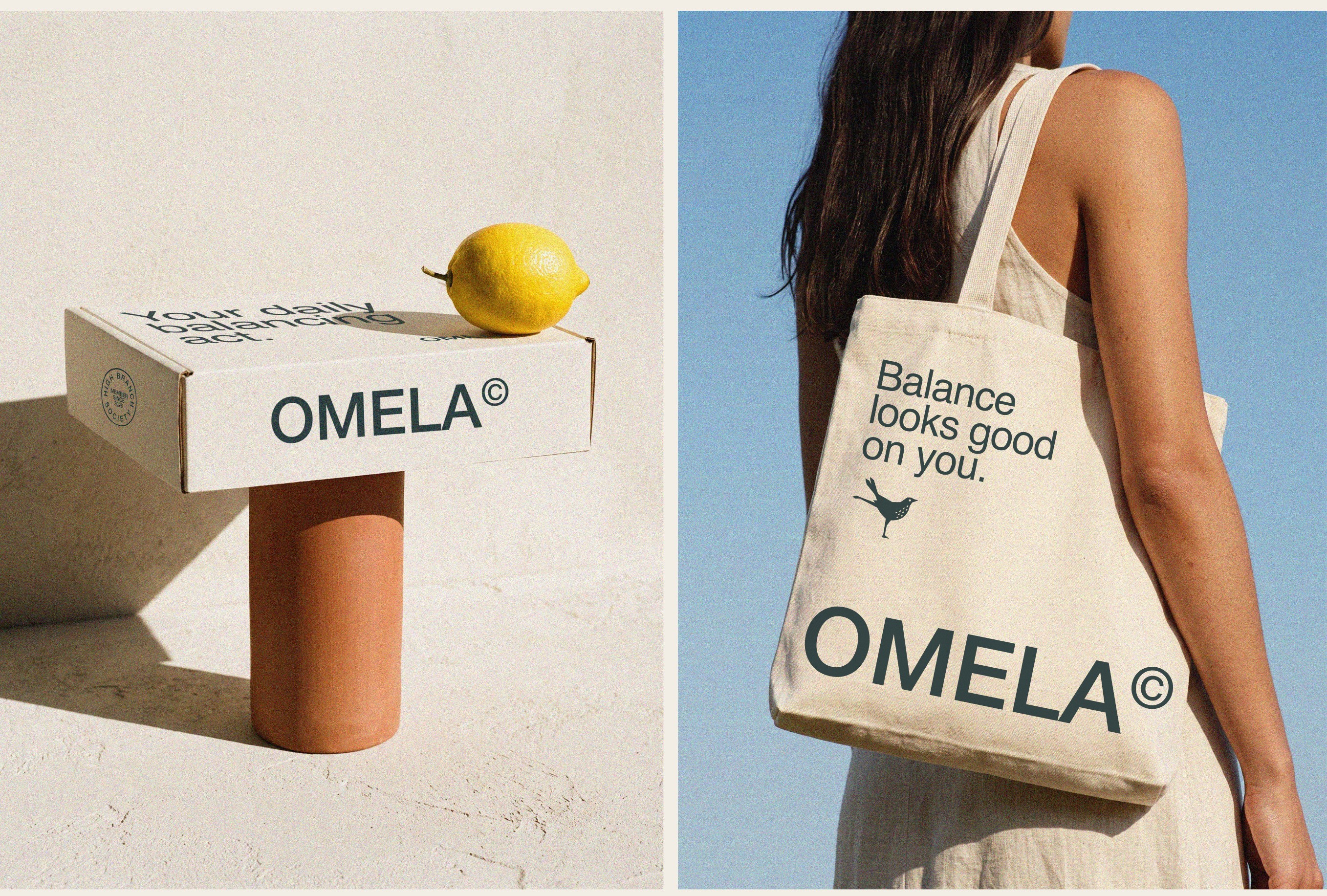
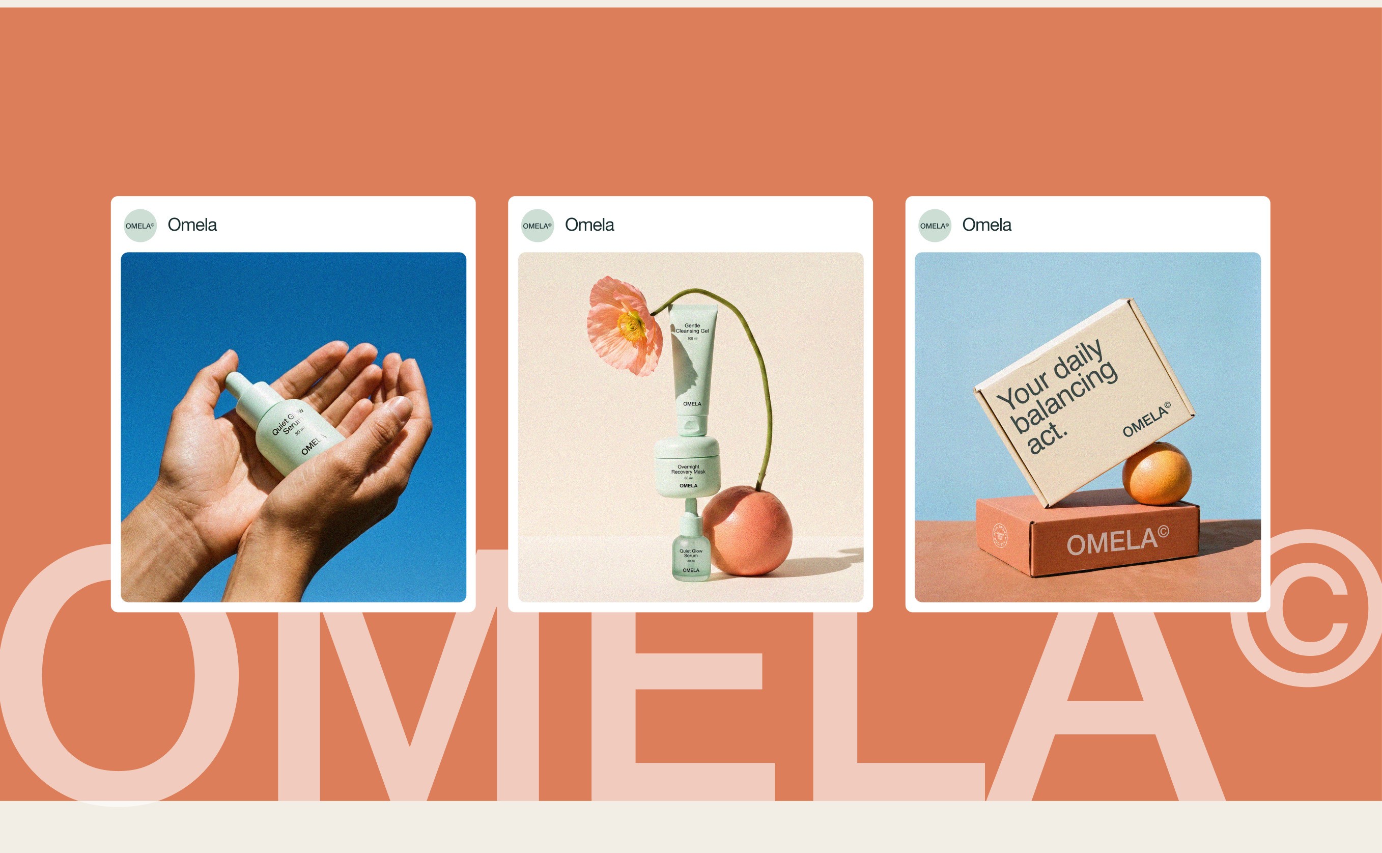
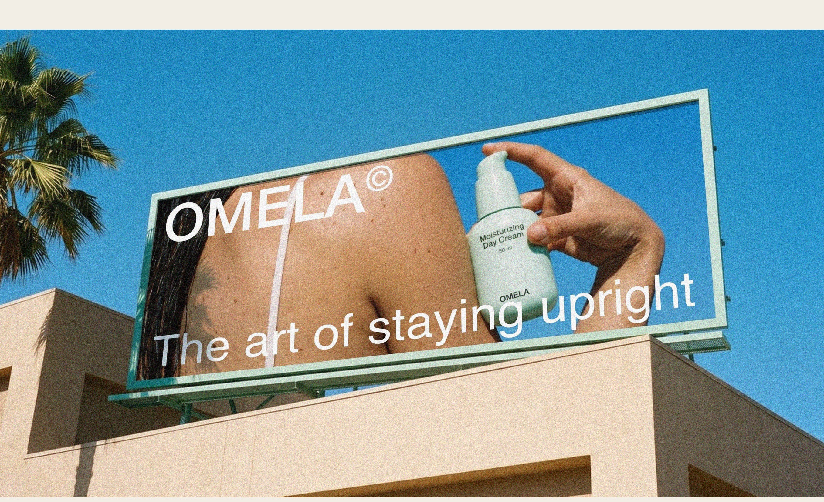
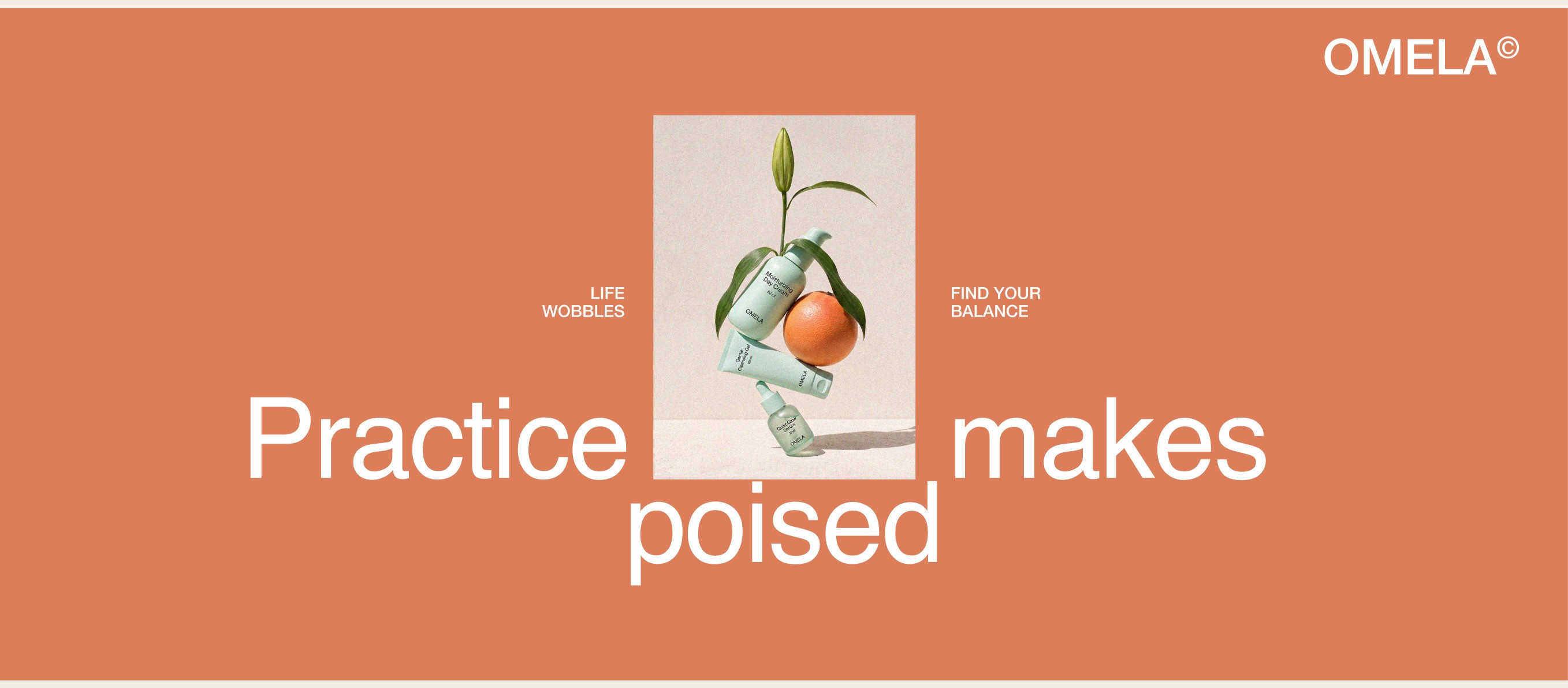
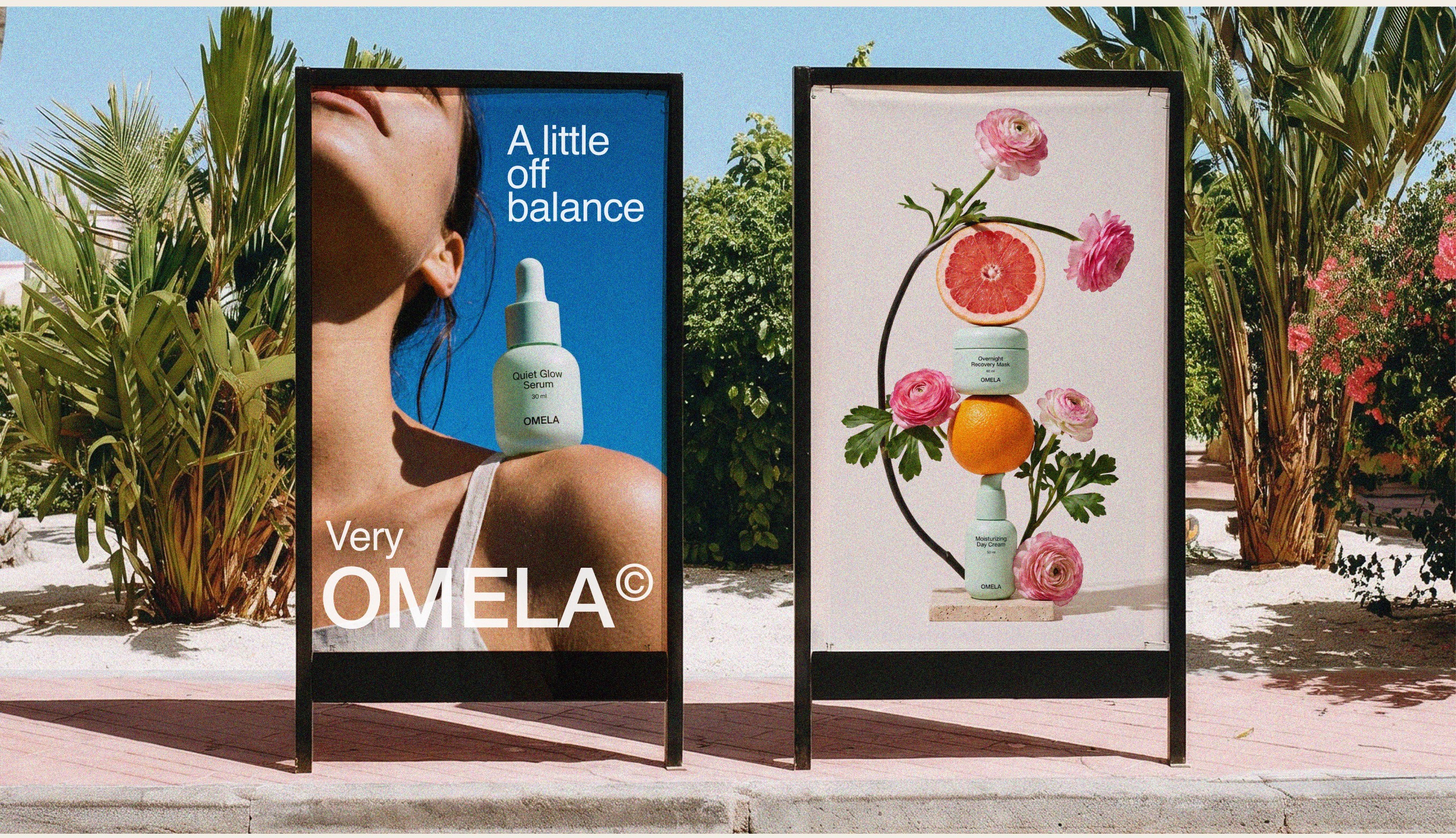
We created the brand from the name up, including logo, symbol, typography, color palette, packaging for a five-product range and art direction. Every image follows one rule: wherever we can, a product rests on a single point of contact, and the frame stops just before it could tip.









Ready to build your owlsome brand?


9am-5pm CEST


